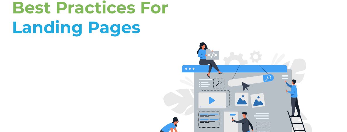
Whether you know it or not, you visit landing pages all the time! It’s in the name, even- when you click on a link that sends you to a website, you have landed on the first page. Landing pages have a specific purpose: to convert leads into sales. Regardless of how you landed on the page, through ad or link or social media, landing pages are the first thing a customer will see. Make sure it’s a good one with these five best practices for landing pages!
#1 – Content, Content, Content
Your landing page copy needs to be clear, concise and should guide your visitor to the action you want them to complete. Good content also speaks directly to the visitor by using “you” and “your” to make them feel engaged. Your headline and images may hook a customer in, but good content is what keeps them reading. Engage the reader, tell them about the benefits, and reel them in.
#2 – Craft a Benefit-Focused Headline
For every 10 people that visit your landing page, at least 7 of them will bounce off the page. To keep that number low, your visitors need to know (and understand) what’s in it for them within seconds of arriving. Your headline is the first thing they’ll read, and it should clearly and concisely communicate the value of your landing page and offer.
#3 – Include the Lead Form Above the Fold
Your lead form needs to be readily accessible should your prospect want to convert right away — you definitely don’t want them searching and scanning your landing page to find your offer. “Above the fold” just means that visitors don’t have to scroll to get to the form — that it’s in view as soon as someone hits the page. This could be a form or an anchor link to the form. Even better: design your form to scroll with the user as they move down the page.
#4 – Add a Clear and Standout Call-To-Action.
The call-to-action (CTA) is arguably the most important element on your landing page design— it’s one of many elements that encourage conversion. The CTA button needs to stand out. You should use a color that contrasts with other elements on the page. Be clear about what you want visitors to do, that is, use an action verb that spells it out for them, like “submit”, “download”, or “get it now”. Depending on the tone, you can even make them more fun or casual, like “Let’s Get Started” or “I Want to Hear More!” Just make sure it stands out.
#5 – Have Relevant Images
The image on your landing page is one the first things people see, and since people process visuals far quicker than they do text, it sets the tone for their entire experience. Make sure these images are coherent and relevant to your business. For example, if you sell computer software, you’ll want your images to have something like a computer monitor, or someone working at a desk looking at a computer.
These landing page tips will help you get started on crafting the perfect landing page design that will hook visitors in and have them stay for awhile! Be genuine in your content, and be engaging. Think about how if you were a customer, what would interest you about the landing page in front of you? What would you be looking for information wise? Do you understand what the business is all about?
Landing pages are the hook to your website, and the beginning of reeling in better conversions and sales. Make yours stand out with the above landing page tips from us to you at Target River!
For help on generating leads or graphic design, contact us and head to our “Solutions” page! We were named 2020’s Best Marketing Agency of the Year, and would love to help!

